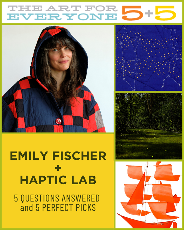
PDN's 46 Reasons to Love Photography Now
Posted in: press On: May 15, 2008 Posted by: raul

"Often the best ideas are the simplest, and the simplicity of 20x200 has generated a lot of buzz from magazines such as Dwell and ReadyMade, and sites such as Boing Boing and ApartmentTherapy. It’s also generated plenty of sales:In March, small-size prints by Colin Blakely and Bert Teunissen sold out in less than a week."While it's true the prints sold out quickly, it didn't take a week, both of those prints sold out in less than an hour.
20x200 in Sunset Magazine
Posted in: press On: May 15, 2008 Posted by: raul

The Sunset Magazine blog has a nice piece on 20x200 this week. Click on over.
Wednesday Edition: Curtis Mann
Posted in: our editions On: May 14, 2008 Posted by: Jen Bekman
Good Wednesday, collectors. I am rushing off to a jam-packed day so I'm going to keep my introduction to today's edition relatively brief. (Shocking, I know.)
Treetops from a series by Curtis Mann called Somewhere in Israel, is another body of work that explores the idea of photographs as objects . (Last week's edition by Kent Rogowski dealt with similar themes, producing an entirely different result.) Curtis does a great job of explaining what he's up to in his statement, so I'll let him speak for himself:
...found photographs of unfamiliar and conflicted places throughout the Middle East and Northern Africa are subjected to a process of selection and erasure. By simply painting on enlarged color photographs with clear acrylic and then bleaching the image with household Clorox bleach, a new and abstract meaning is being forced out of these family snapshots, travel photographs and casual documentations.
The photograph is physically and contextually altered; as a result, the work has the ability to oscillate between image and object, photography and painting, real and imagined. I am constantly trying to force the medium to function outside of its initial utility and use its malleable nature as a way of coming to an ulterior understanding of the complex and the unfamiliar. This new reading attempts to shift and expand the limits on how we perceive and understand the fragmented world in which the photograph attempts to represent.
Today is a big day for Curtis; in addition to making his 20x200 debut, he's got a big opening in New York tonight. The Ubiquitous Image, curated by Aperture publisher and Hey, Hot Shot! panelist Lesley Martin, includes several images from this series. The show is one of the four main exhibitions that are the centerpiece of The New York Photo Festival.
Tonight's opening is the first of a flurry events happening over the next few days, including the aforementioned Curating 2.0 panel that I'm participating in on Friday. Curtis is a Hot Shot who first showed with me back in Fall 2005 and is, as of this writing, a 20x200 artist. In other words: he's a perfect example of my 2.0 curatorial practice. I couldn't think of a better day to introduce his work to all of you!
Having introduced you, I'll take my leave till tomorrow. That's right tomorrow! In case you've forgotten (or didn't read that far) we're doing a special bonus edition tomorrow to benefit SFJAZZ. This means even more art for everyone, and that should be music to your ears.
Tuesday Edition: Sarah McKenzie
Posted in: our editions On: May 13, 2008 Posted by: Jen Bekman

Site, by Sarah McKenzie
Greetings, collectors near and far, on this most lovely of Tuesdays. NYC is bright and breezy today, which is quite a relief after a Monday on which I considered it might be time to build an ark. With that project back-burnered for the moment, I can focus on the buildings of others. Or the paintings of buildings of others. Or is it the prints created from the paintings of buildings of others? Yes, that one! Let's get on with it shall we?
Today's print edition is Site, by Colorado-based painter Sarah McKenzie. I am particularly proud, excited and pleased with this edition as it's the result of my museum-related edition scouting. I first saw Sarah's work in February, when I was in Minneapolis and attended the opening for Worlds Away: New Suburban Landscapes at The Walker. (Incidentally, I am totally nuts for both that show specifically and the museum in general . Highly recommended!)
Since the advent of 20x200, I wander through galleries, museums and art fairs jotting down the names of artists I like in my Moleskine. I am convinced that pretty much every artist should do an edition with us, every artist I like at least, and given the opportunity I will ask accordingly. I'm not afraid of "No", nor am I inclined to accept it as an answer. See how hard I work for you people?
During my Walker wanderings, I saw Sarah's amazing painting and her name and the painting were jotted down in my notebook with high hopes.* Flash forward to a few months later, and here I am presenting you fine people an edition from Ms. McKenzie! A museum piece, no less! (Thanks to the Walker for accommodating us to shoot the piece.)
Site got to be in the museum for a reason - Sarah wields a paint paintbrush deftly, giving us a fresh view of the banality of suburbia. I shift through different impressions each time I look at it. At first glance it seemed photorealistic, in part because it reminds me of the ground well-trod by many of my favorite fine art photographers. But look closely and it's clearly not quite real -there is a flatness in both her paint and perspective that has the primitive feeling of folk art. Take that flatness in and allow yourself to focus on the lines, angles and grids of her work; suddenly you're fully immersed in geometric abstraction, a la the 20th century Modernists. The familiarity of the subject matter allows me to travel through these genres with ease, unencumbered by that uptight "Do I really get it?" feeling. Of course I get it! I've been driving past it my entire life, as have many of you, I'd imagine.
I've always found that being able to move through something with ease can lead to a deeper understanding of a subject. If I can shed the weight of what I don't know, I learn more. (Insecurity and uncertainty are a drag.) Sarah's paintings have instant appeal and familiarity, so they're immediately engaging. Once engaged, I look closer at everything: the subject, how she paints it and the history she's building on. What I don't know is more interesting, and less intimidating; it helps me enjoy what I do know even more by giving me greater insight and connecting my experience to a larger world. So, thanks Sarah, for giving me a fresh perspective and making my world bigger. I hope that she does the same for you.
I'll be back tomorrow with some boundary-broadening photographic work from an artist who's been evolving and growing before my very eyes. We've also got a special bonus edition coming on Thursday, so: Mark your calendars! We'll be introducing an edition to benefit SFJAZZ on the eve of their 25th Anniversary Gala honoring jazz great Wayne Shorter.
I've never wished I could be in more than one place at once more than I am wishing it this week. I am missing the gala, which I'd love to attend for sentimental reasons having to do with both jazz and San Francisco. I just couldn't get away, however, since New York City is positively jumping with The New York Photo Festival and its attendant parties, exhibitions and events.
On Friday evening, as part of Apeture Presents at the NY Photo Fest, I'm on a panel called Curating 2.0 with Laurel Ptak of i heart photograph and Tim Barber of tinyvices.com.
Another not-to-be-missed event this week: the annual benefit for Rhizome supporter, lover and uniter of art and technology.
Lots to do!
* I actually wrote down a lot of names from that show because, like I said, it's a great one and it's full of amazing contemporary artists many of whom I was unfamiliar with until I saw the exhibition. So much 20x200 goodness is in store, yesiree!
Wednesday Edition: Kent Rogowski
Posted in: our editions On: May 7, 2008 Posted by: Jen Bekman
Frenzied Wednesday greetings, collectors! I'm sitting in the gallery typing away as the crew puts the finishing touches on Love = Love, an exhibition of large scale photographs and puzzle montages by Kent Rogowski.
Today's edition, Untitled #9, is photographic print based on a unique puzzle montage that is being hung in the gallery right this very second. An edition of 3 exhibition-sized (44"x57") prints are available as well. Back in my days of Disney toil, we'd call this synergy. I gotta say though: synergy then was never so much fun as all this.
I have two major thinky obsessions related to photography, the relationship between photographer and subject in portraiture is the first; the second is the consideration of a photograph as an object rather than as a document. (The latter topic has become especially fascinating since I started doing 20x200.)
Kent's project really pushes the topic of object vs. document. He's taking objects made from photographs, deconstructing them, reassembling them, documenting those reassembled objects and then to top it all off, these documents become different objects entirely when you present them at different sizes. Which is what the exhibition is all about.
Doing a 20x200 edition is the meta-est manifestation of the concept; the effect of the grid-like fault lines of the puzzles varies enormously depending on the dimensions of the print. Their presence is most obvious at its smallest and largest sizes, but in totally different ways.
As I say in the exhibition's press release, I fell in love with Love = Love immediately. I have a practically Pavlovian response to the bright and shiny, so they had me at hello. Throw in nostalgia (puzzle making seems awfully old-fashioned in these days of Wii) and the thinky parts, and I was goner than gone. Ask anyone who knows me — I have basically not shut up about the damn things since I finally saw them in person at Fotofest in March.
Bert Teunissen and I had a long discussion about all of this on Monday evening, over wings and margaritas at Great Jones Cafe. (First class treatment for my international friends: always guaranteed.) He himself is the king of the photograph as a document, so the conversation was particularly intriguing. I can't wait to hear what he thinks when he sees Kent's photos at the opening tonight.*
I'd love to know what you think too - I hope to see a good showing of 20x200 collectors at tonight's reception. The gallery's located at 6 Spring St, just off the Bowery, festivities commence at 6. As an aside, you can stay up to date on gallery happenings by signing up for our mailing list.
I'm off to attend to the last details of the day. See you later, ok? OK!
*Confidential to Bert: You are so totally on the hook to show up now, just like you promised.
Tuesday Edition: Chi Birmingham
Posted in: our editions On: May 6, 2008 Posted by: Jen Bekman
Like Alice's White Rabbit, I'm late, late, late for a very important date. So my fine collector friends, I will give you the briefest of free-association introductions to today's wonderful fine art edition from Big Sur born, Brooklyn dwelling artist Chi Birmingham.
Studio Apartment brings to my mind a few disparate things:
- The movie Rear Window
- A recurring dream that I have wherein I suddenly discover a whole extra room in my apartment. (Bummer waking up to reality from that one, let me tell you.)
- My waking dream, hope, most fervent wish that one day soon I'll get to move to an apartment on a high floor, better yet the top floor, flooded with natural light. (I am currently cave-dwelling underneath what must be a herd of elephants. My beloved art is all crooked on the walls from the continuous rumble.)
- Wood grain and sage green are most pleasing to my eye.
- Perhaps I should consider a house plant? One that doesn't require much natural light.
And now back to my preparations for Kent Rogowski's solo show, Love = Love, which opens tomorrow at the gallery . It's so freaking great, I can hardly stand it. More on that in my next dispatch. Until then: adieu!
Rachel Sussman Solo Show @ Michael Steinberg
Posted in: photographers On: May 4, 2008 Posted by: Lia Bulaong
Welwitchia Mirabilis #0707-22411 by Rachel Sussman
Unsurprisingly, Rachel Sussman's 20x200 edition from earlier this week, Towards Christiana (Copenhagen), is sold out in all but the largest sizes already. The collectors who get the large ones are lucky ducks though — it just so happens that Rachel's photographs are particularly fantastic as big prints. Of course you should take my word on it, but why not see it with your own eyes?
If you're a NYer, or are planning on visiting our fair city any time this month, make your way to Michael Steinberg Fine Art over in Chelsea where you can see ginormous, delicious prints from Rachel's ongoing The Oldest Living Things in the World series.
For over a year now, Rachel's been "researching, working with biologists, and traveling around the world to photograph living organisms, aged 2000 years old and older." I love that she's chronicling her adventures on her project blog, as well as accepting frequent flier mile donations to offset what must be tremendous travelling expenses—if you've got any to spare, please consider sending them her way! "You'll receive a special limited edition print," she says, "in addition to my undying gratitude." Places still on Rachel's list include Tasmania, Southern Australia, Greenland, Sri Lanka, Antarctica, Ibiza, Crete, Sweden and Northern California, so she's still got lots of flying to do.
Frequent Flier miles aside, adding the work of an emerging artist to your collection is a meaningful and lasting form of support. We've still got those two 30"x40" prints of Rachel's available for purchase and we're also offering an edition of 3 prints at her above-mentioned ginormo exhibition size of 44"x54". Drop an email to collector at 20x200 dot com to learn more about those.
The Oldest Living Things in the World
Solo Show @ Michael Steinberg Fine Art
May 1-31st
526 West 26th Street, Suite 215
Jennifer Sánchez in Intricacies
Posted in: artists On: May 4, 2008 Posted by: Lia Bulaong

ny.08.#05 by Jennifer Sánchez
Atlanta collectors, you're in for a treat: Jennifer Sánchez is showing three of her newest paintings at Soho Myriad's group show, Intricacies, which opened just this past Friday in your fine city. If you think her 20x200 prints ny.07.#20 and ny.07.#34 look amazing online, just wait till you see her paintings in person; I guarantee you'll be knocked out.
P.S. We've got the originals of both her 20x200 editions for sale—please email collector AT 20x200.com if you're interested. ny.07.#20 is all sold out, but we've still got two prints of ny.07.#34 in large, so grab one while you still can.
Intricacies @ Soho Myriad
1250 Menlo Drive
Atlanta, Georgia 30318
May 2 to September
Wednesday Edition: Rachel Sussman
Posted in: our editions On: April 30, 2008 Posted by: Jen Bekman
Wednesday greetings, collectors. You're going to have to forgive me for keeping it brief — it's my last day in SF and in spite of my best intentions, yesterday's ambitious plans went uncompleted. To make matters worse, I am already way behind, as evidenced by the lateness of this dispatch.
Fortunately, today's photography edition, Towards Christiana (Copenhagen), is so gorgeous; a song and a dance from me isn't needed to convince you of its aesthetic merits. That said, I'd be doing you all a disservice if I didn't call attention to photographer Rachel Sussman's rigorous and adventurous artistic practice.
Like today's edition, all of Rachel's images are unfailingly stunning — they're lush, epic and beautifully composed — but she creates these tableaux in the service of some big ideas and ambitions that have, quite literally, taken her all over the world.
One special note about this edition: It's offered in our three standard 20x200 editions, but we also have an edition of 3 prints available at Rachel's normal exhibition size of 44"x 54". They are amazing! You can mail collector at 20x200 dot com for more information about those.
Rachel showed another photo from her Lost in Paradise with me back in 2005 as part of the very first Hey, Hot Shot! showcase. Since then, she's gone from being a photographer with a day job to someone who spends most of her time making pictures.
All her hard work has paid off! Her solo show, The Oldest Living Things In The World opens @ Michael Steinberg Fine Art in Chelsea tomorrow and it promises to be a real treat.
As for me, I've got some San Francisco treats to stock up on. I'm off until next week, when I'll be coming to you live from New York. See you then!
Postcards by Tommy Perman
Posted in: artists On: April 30, 2008 Posted by: Lia Bulaong
We here at Jen Bekman World Domination HQ are by nature rather excitable when it comes to people making their art affordable and therefore accessible, so it's pretty great that Tommy Perman's got a pack of postcards for sale. For £8 you get 16 tiny prints of drawings he's made over the past five years—including a small version of his recent 20x200 edition, Trucks, Seattle, which we'd be more than happy to send you a 8.5" x 11" print of for just $20. Bargains all around!
P.S. Not to gender-stereotype or anything—especially since I was the kind of little girl that had collections of GI Joes and Micro Machines—and hopefully this isn't an overshare but: wow, writing this post + my biological clock = totally making me fantasize about having a little boy and hanging Tommy's Trucks and postcards in his bedroom. How cute would that be? Pretty darn cute, I say.
Tuesday Edition: Amy Park
Posted in: our editions On: April 29, 2008 Posted by: Jen Bekman
Greetings from the West Coast, my collector pals. I'm still visiting San Francisco and have been enjoying all kinds of arty goodness during my trip. More on that later, because really the main point of this missive (as you well know!) is to introduce today's edition.
Corner Light Monadnock is based on an original watercolor painting by NY-based artist Amy Park. All of Amy's gorgeous architectural paintings render the solidity of bricks and mortar with a precision one would never expect to be coaxed from watercolor. (Well, this one would never expect it, at least.) As a medium, watercolor can be inconsistent and difficult to contain; their use in Amy's work gives the buildings a dreamy, cinematic intensity well-suited to the feeling I get when walking through the deserted caverns of Wall Street on a weekend afternoon.
There's a theoretical future version of myself who lives in a cottage in the woods (somewhere near Point Reyes, preferably.) Future me rides her bike into town in the morning to pick up her mail from the PO and kibbitz with the locals over coffee. Future me is more like fantasy me, however, because really I'm a city girl at heart - more at home in the wilds of Manhattan than amongst the redwoods. Amy's work speaks to past, present and yes, future me as well. It captures the majesty and menace of the urban landscape and transports me into it from wherever I may be. And in spite of its foreboding, I really want to be there.
Most of my San Francisco trip has been spent downtown and South of Market, amongst its own glass and brick towers. On Saturday, I caught the last day of America by Car, a very fine Friedlander show at Fraenkel Gallery. I also got a sneak peak at their upcoming Christian Marclay exhibition Stereo which is going to be totally amazing, I promise.
I've found lots of prints of the not $20 variety to covet along the way - a couple from Marclay, a little something from Chris Johanson printed by Paulson Press and later on today I'll pop into the venerable Crown Point Press to ogle their Amy Sillman and Julie Mehretu prints. Not to mention the fabulous and funny Los Francisco San Angeles prints from Ed Ruscha. After that I'll get my SFMOMA on, where I'm hoping to have time to get a closer look at their current Friedlander exhibition, an incarnation of which I saw all too briefly when I was at Foam in Amsterdam over the holidays.
Tomorrow's a toss up. Future me wants to squeeze in a trip to Pt. Reyes. But art fiend me wants to head to the East Bay and visit those prints at Paulson Press in person. Decisions, decisions! I'll let you know what the plan is in the morning, when I'll be back with a photo edition most fine, my last San Francisco dispatch before heading home to the sidewalks of New York on Thursday.
Jason Polan in ART SHOW
Posted in: artists On: April 29, 2008 Posted by: Lia Bulaong

Giraffes Thing by Jason Polan
The super awesome Mr Jason Polan and his equally amazing friend Derek Erdman have a two-man show opening today in Chicago, and here are three reasons why you should go:
- Jason's Hand Project manages to be both one of the most fun and most interesting 20x200 editions—each print is actually a one-of-the-kind original! As Jen said in her newsletter: "Thinking about my hand, and everything (yes, everything!) it allows me to do, thinking about a photocopier as an artist's tool, recognizing the immediacy, intimacy and authenticity that springs from the in-person interaction required for an actual handshake - these are all things I'm happy to notice and to honor."
- I've never met him or even had an online conversation with him, but the stuff Derek puts online cracks me up. Check out one of his drawings from last month, for example: Jason Polan in a Pith Helmet.
- There will be a book accompanying the exhibition, which you can get there. Or you can email the artists, but if you're in town you should just go to the show—you'll see their stuff in person and save postage too! Win-win.
Oh, and one more thing: Jason says there will be snacks! Art + snacks, what more could you possibly want? So here are the details:
ART SHOW
All new work by Derek Erdman and Jason Polan
Tuesday, April 29, 2008 5-7pm
Hollander Fireproof Warehouses
1624 W. Milwaukee
Chicago, IL
Todd St. John in Big Kids/Little Kids @ Cinders
Posted in: artists On: April 28, 2008 Posted by: Lia Bulaong

Wave Fade by Todd St. John
20x200 edition maker Todd St. John has two pieces in the Big Kids/Little Kids travelling show that ends its run in Brooklyn's Cinders gallery on May 4th. Curated by John Freeborn, the show focuses on current work by 38 artists represented in Freeborn's Big Kids/Little Kids book as helping shape and inspire the first eight years of Philadelphia's underground arts scene by working or showing in its spaces.
Todd created a limited edition hand-screen printed dust jacket of Big Kids/Little Kids; each of the 50 copies of the 120-page book is signed and numbered by Todd, and is available for $30 + shipping, which is a great deal. Perhaps even better: we still have prints of his super stylish 20x200 edition Untitled (Black Blocks) available in all sizes, and our prices start at just $20.
Sign Up for Our Newsletter!
Posted in: announcements On: April 25, 2008 Posted by: Lia Bulaong
Pollution Post Unlimited by Andrew MacRae
Friends, if you're all OMG! TGIF! today because you've been cooped up working indoors all week while the weather's (finally) been lovely outside, I feel your pain. Before letting you go for the weekend though, I feel like it's my duty to point out that if you still haven't signed up to receive our fantastic newsletters yet, you're missing out. I mean, our newsletters, all missives straight from our fearless leader Jen Bekman, alert you to our newest editions before they appear on the site! We've had some recent editions sell out almost immediately after the newsletter started hitting inboxes—Luke Strosnider's Every Chair At the Visual Studies Workshop, Carlo van de Roer's Bondi Baths, two pieces by the Starn twins were all gone within minutes—so signing up for our early warning system is the only way to ensure you have a chance greater than zero of getting particular pieces.
Our Raul wrote some notes on quick selling editions last week and it's well worth a read, especially if you missed out on one of those pieces I mentioned earlier! And if you did, maybe you will take some consolation in the fact that I did too—so when I say I know how you feel, I really really do. There are precious few prints left of Andrew MacRae's beautiful Pollution Post Unlimited (view larger image), maybe snapping one up right now before anyone else does will assuage the pain.
Jennifer Sánchez at NEXT Art Fair Chicago
Posted in: artists On: April 24, 2008 Posted by: Lia Bulaong
Fans of Jennifer Sánchez*, if you find yourself in Chi-town this coming weekend for Art Chicago 2008, please make sure to check out her work at its newest sibling NEXT: The Invitational Exhibition of Emerging Art, which will be occupying the entire 7th floor of the same venue. Here's a bit more about it: "More international than any other young fair of contemporary art to date, NEXT boasts galleries from every important art city in the world, including Chicago, New York, Los Angeles, Toronto, Mexico City, Sao Paulo, London, Paris, Berlin, Frankfurt, Leipzig, Copenhagen, Amsterdam, Tokyo, Warsaw and Bucharest."
Alas, Jennifer won't be in town herself to press the flesh, but her mesmerizing paintings will be on display at Kinsey/DesForges, booth #7-9038.
*I know there are lots of you out there because both her 20x200 editions are completely sold out, save the two large prints + the original of ny.07.#34—so grab one while you still can!
Christina Muraczewski @ Open Studio
Posted in: artists On: April 24, 2008 Posted by: raul
http://www.christinamuraczewski.com/
If you happen to be one of our dedicated Los Angeles collectors be sure to stop by 20x200 artist Christina Muraczewsi's space at Open Studio 2008.
May 3rd-4th 12pm-6pm
Santa Fe Art Colony
2401 South Santa Fe Ave.
Los Angeles, CA 90058
Christiana's prints on 20x200 are almost sold out but there are still a few medium and large sized prints of Daisy and Polly available. The Polly original is also still available.
Muraczewski has just launched a brand new website.
Kate Bingaman-Burt, Etsy Featured Buyer
Posted in: artists On: April 23, 2008 Posted by: Lia Bulaong
Kate Bingaman-Burt is all about Obsessive Consumption—she's made a personal brand out of drawing her purchases and credit card bills—so it only makes sense that she was last week's Featured Buyer over at Etsy, the online marketplace for handmade things.
I love the graphic she made to go with the Etsy piece, which incorporates her drawings of things she's bought off the site, just as I love her blog (everyone should have one, and hers is great!), her 20x200 editions Carts #1 and I Bought All of These, and her solo show at Jen Bekman Gallery last fall; everything Kate puts out has this amazing energy and sense of fun and whimsy that makes me so happy just to look at them. Sounds cheesy, I know, but it's totally true.
Wednesday Edition: Luke Strosnider
Posted in: our editions On: April 23, 2008 Posted by: raul

Every Chair At the Visual Studies Workshop, by Luke Strosnider
The image above is the medium sized print in this edition. It includes 45 of Luke's favorite chairs.The small prints are of individual chairs:
And the large 30"x40" print is of all 521 chairs:
Greetings from the West, collector friends! I write to you from San Francisco, bundled up in a cozy wrap to ward off the delicious chill of morning fog. I love the cozy, and I love today's photography edition by photographer, writer and all around smart guy Luke Strosnider.
Our editions of Every Chair at the Visual Studies Workshop are a shining example of why doing 20x200 is so much fun. I love figuring out interesting ways to experiment with our format without breaking it; Luke's project provides an excellent avenue for such an inquiry.
His typology of chairs is so good - simple, funny and somehow really touching. As with all typologies, his treatment of his subjects speaks simultaneously to sameness and difference. We've structured the edition in a way that allows collectors to look at them the same way.
Our edition of 200 is comprised of 200 unique chair portraits - every collector will receive a different, randomly chosen photo. In treating his subjects as though he is shooting traditional portraits, he anthropomorphizes them; considered singly, each seems imbued with its own character. Certain chairs elicit from me the cooing and aww-ing I normally reserve for the sight of otters holding hands. Others are velveteen rabbits well-used, but taken for granted. Every single one is unique, selected from the pool of 522.
Our medium edition is a well-thought out grid, representing the variety of chairs Luke's documented. Considered together and carefully arrayed, this version speaks to my design-jones, delivering a deft, populist and decidedly contemporary response to the Vitra Design Museum's iconic chairs poster.
Our largest edition drops science. Consider it the periodic table of 522 chairs of the Visual Studies Workshop. Luke explained to me via email that the ordering (L to R, starting in the upper L) is the order in which I made the photographs. It was important to me that this project reflect some measure of the passage of time: my own time, "photographic time," and the history of the Visual Studies Workshop. At first blush it seemed off-kilter, but then I came to realize that its asymmetry spoke directly to the project's authenticity, intelligence and charm.
Luke has been one of my internet (and less frequently, in-person) pals for a while now, connecting with the gallery in various ways. Two of his Visual Studies cohorts, Kirby Pilcher and James Rajotte, are Hey, Hot Shot! alumni. Luke himself has been a frequent visitor to the gallery and has written intelligent commentary about several exhibitions. His response to Nina Berman's debut at my gallery was thought-provoking and his review of Photographs from the New World for Afterimage was one of the best things written about the show. (And a lot was written about that particular exhibition.) When Luke debuted his chairs project on Flickr, I was totally thrilled, because I knew that it was the perfect opportunity for us to finally work directly together on something.
I couldn't be more pleased with the results. The edition has a lot in common with other interactions I've had with Luke - it's been fun and inspiring and it's made me look at things a little differently. Exactly what art and artists should do, so very well done by Mr. Strosnider.
And with that, I take my leave till next week, when I'll be back with more art and tales of the West. Have fun out there!
Tuesday Edition: Tommy Perman
Posted in: our editions On: April 22, 2008 Posted by: Jen Bekman
Trucks, Seattle, by Tommy Perman
Tuesday greetings collectors! After a week of Starnmania, things are getting back to normal around here. Which means that today is fine art day, tomorrow is photo day and I'm about to hit the road.
Trucks, Seattle is based on an original drawing by Scottish renaissance fella Tommy Perman. I first came across Tommy's work back in January, via one of the countless art and design blogs in my RSS feed. I was really taken with his drawings of cityscapes and cars and I was very pleased to discover that he too was interested in making affordable versions of his artwork. I immediately snapped up one of his postcard packs and after that we decided to do an edition together.
As per usual there's a random assortment of things that make this drawing particularly appealing to be. The trucks are gathered together in a way that reminds me of a herd of elephants, and it just so happens that I am fascinated by elephants. The red and blue Tommy uses in the drawing are a close approximation of the colors in my gallery's logo. But first and foremost, I look at these cement mixers all lined up and imagine one of my friends' kids, most likely a boy of 3 or 5, lighting up at the sight of trucks. There's something about the pure joy that a little kid can summon at the site of a roaring hunk of metal that really warms my heart.
A roaring hunk of metal of the airborne variety will be transporting me to San Francisco later today. I'm participating in a Small Business Hacks roundtable at Web2Open, which is the unconference that coincidences with the bigger, more conference-ier Web 2.0 Expo. Aside from conference-related stuff, art will be seen, meetings will be had and newsletters will be written. For now, I'm off to try to undo the over-packing I've done. Look for me tomorrow, when I'll write from the left coast to introduce this week's photo edition.
Dustin Hostetler + Fernanda Cohen in Tote / Bag
Posted in: artists On: April 22, 2008 Posted by: Lia Bulaong
Tote Bags by Dustin Hostetler (left) and Fernanda Cohen (right)
20x200 edition makers Dustin Hostetler (a.k.a. UPSO) and Fernanda Cohen are two of the many artists with pieces in OPEN SPACE Beacon's current Tote / Bag show, which aims to raise environmental awareness and encourage us to "switch from a disposable society to one which reduces, reuses and recycles."
Dustin created one bag for the show and Fernanda made two (1, 2); all three are available for $100 and proceeds from the sale of the show will be donated to Hudson River Sloop Clearwater, a non-profit which conducts environmental education, advocacy programs and celebrations to protect the Hudson River, its tributaries and related bodies of water.
P.S. We've still got prints of Dustin's Color Study #4 and Fernanda's Hot Dog and I available, if you'd like to see more of their work! I think they're both splendid, they're two of my all-time favorite 20x200 editions.
Special Monday Edition: The Starn Twins
Posted in: our editions On: April 21, 2008 Posted by: Jen Bekman
Greetings collectors and welcome to Starn Twins for 20x200: The Sequel. This is a special bonus edition, coming hot on the heels of last week's Blind Spot benefit edition.
Structure of Thought 6a is printed on translucent vellum and is a beautiful print on its own, so if you didn't get the first one, don't hesitate to click through and grab a print. And of course, it can be layered over Structure of Thought 6b. I sat in the studio with Mike and Doug and we experimented with the proofs, trying to decide the best way to layer them effectively. The objective is twofold: creating a little space between the two layers allows the light to move through the vellum, illuminating the lower print, and when the vellum is suspended it also creates some ripples in the paper, mimicking the texture of their works done on varnished papers. We came up with two solutions:
- The nothing fancy solution: Small plain tacks set in a bit from the corners of the bottom layer.
- The somewhat fancier pro-framer solution. Your framer can use archival paper hinges to affix the vellum layer to the cotton rag layer, creating the same effect as if by magic. (Since the hinges won't be visible.)
Are you still reading this?! Come back and finish up later, this edition is sure to sell out quickly so go ahead and buy one now
I'll be back on Tuesday and Wednesday with regular fine art and photography editions. See you then!
A few words about this edition:
- It's only available in the $20 and $2000 sizes.
- Purchases are limited to one print of each edition per collector and/or mailing address. We reserve the right to refund purchases if we determine that a single collector has acquired multiple prints.
- It's not going to ship right away. We expect to be able to ship it well within two weeks, which is not our usual speedy standard. (It's worth the wait, promise!)
- While you can layer this with our previous Starn edition, each edition is a separate piece. You don't need one to complete the other. And there is no guarantee that people who bought the first will receive the second.
- All prints are sold on a first come, first serve basis.
- We cannot combine shipping with this edition. Our apologies!
Ian Baguskas Review in Design Arts Daily Newsletter
Posted in: photographers On: April 21, 2008 Posted by: Lia Bulaong
Palms, by Ian Baguskas
Let's start the week out right with congratulations to Ian Baguskas, the 20x200 edition maker and Hot Shot Ne Plus Ultra recently named to PDN's 30, whose current show at the Jen Bekman Gallery just received a lovely review by Peggy Roalf in the AI+AP's Design Arts Daily newsletter; Roalf says his Sweet Water is "one of the most beguiling exhibitions on view in New York."
If you're in the city, you really should go see it—if you think Ian's images look amazing on your screen, know that you'll find them absolutely mesmerizing in person. Sweet Water has been extended to May 3rd, so you've got time! We've still got prints of Ian's 20x200 edition Kamping Kabins available in all three sizes; I'm sure one of them would look great on your wall.
Birthe Piontek at Maison de la culture Frontenac
Posted in: photographers On: April 18, 2008 Posted by: Lia Bulaong
Untitled (from Sub Rosa), by Birthe Piontek
À nos amis Montréalais, we're pleased as punch to say 20x200 edition maker, Hot Shot! Ne Plus Ultra, and newly-minted PDN 30 Birthe Piontek will be one of ten photographers showing their visions of home in Bienvenue, a show opening at your lovely city's Maison de la culture Frontenac this coming Thursday, April 24th. We've still got prints of Birthe's moody, beautiful Untitled (from Sub Rosa) available, and think it would be a vision in your home!
Thursday Edition: Carlo Van de Roer
Posted in: our editions On: April 17, 2008 Posted by: Jen Bekman
Is it Spring yet? It just might be. We're being teased mercilessly here in NYC, where it's been brilliantly sunny, yet not quite warm enough, for seemingly forever (and today.) I have a feeling that it'll switch over to swelter overnight, and swimming season will be upon us.
Untitled (Bondi Baths, Sydney, Australia) 2007, our second offering from Kiwi shutterbug Carlo Van de Roer's Swim series, is a well-suited accompaniment to this line of thinking, wouldn't you say? (Note: I just can't help myself with the puns, it's practically a sickness. Brace yourselves, there's more.)
Carlo's first edition, Untitled (Astoria Park, Queens, New York), made quite a splash when we introduced it just before Christmas. The entire edition sold out in short order; clearly, everyone was into the pool.
20x200 collectors have been thirsting for more ever since, so while Carlo and I were hanging out at Fotofest in Houston, we fished out another fine specimen to offer from the series. We chose Untitled (Bondi Baths, Sydney, Australia) 2007 because aside from having pools and swimmers in common, this image is clearly the best mate to Astoria's composition.
Ok, basta with puns. I've got a huge backlog of email to dive into and schedules to synchronize. I set sail for San Francisco on Tuesday, so the crew and I are rushing to get everything ship shape before I go. (Of course I'm not sailing, but you know...)
Ahoy till next week, mateys!
Aili Schmeltz at Rosenberg Gallery
Posted in: artists On: April 17, 2008 Posted by: Lia Bulaong

Goucher Glacier, by Aili Schmeltz
LA-based artist Aili Schmeltz has been kind enough to grace us with not one but two beautiful 20x200 editions examining her love/hate relationship with the city she lives in: last November's Radar and the piece that opened this month, Embedded, both now only available in the medium and large sizes. If you like Aili's work as much as we do and find yourself in Baltimore this month, please stop by the Rosenberg Gallery, where she's installed her large piece Goucher Glacier as part of the group show Ethnography of No Place. The exhibit is open weekdays from 9 to 5, and closes Friday, May 2nd.
Jason Polan
Posted in: artists On: April 16, 2008 Posted by: raul

20x200 artist, and favorite person who hangs around the office, Jason Polan is featured on Cool Hunting today. They spotlight his 20x200 Hand Project among many of his other excellent artistic ventures. The still above is from Jason's video How to Draw an Apatosaurus.
Wednesday Edition: Ian Carpenter
Posted in: our editions On: April 16, 2008 Posted by: Jen Bekman
Yesterday was a record-breaking day in 20x200's short history. Our Blind Spot benefit print, the first of two editions from Starn Twins, was gone in seven minutes! I had a feeling it'd be popular, but we didn't anticipate just how fast it would go. Lucky for the disappointed many, there's another edition from Mike + Doug in the works that we'll be announcing any day now; as usual, list subscribers will be the first to know.
For the moment, let's turn our attentions to the colorful Chamonix, an archival pigment print based a gouache on wood original by NYC painter Ian Carpenter. Ian's inspiration might be coming from the snowy mountains of Chamonix-Mont-Blanc in Eastern France, but run through the technicolor filter of his imagination it becomes a valley town from another planet.
His own inspirations aside, the use of color and his playful juxtaposition of forms inspires in me an utterly random and enjoyable stream of consciousness, touching upon many of my favorite things, some far away, and some nearly forgotten: the Southwest, candy, a beloved acid-green jacket that I wore in high school (it was the 80s, shut up), looking down at cityscapes from airplanes and the decaying World's Fair structures out in Queens. These are just a few things which have presented themselves to me while looking at this painting.
What can I say? The mind works in mysterious ways. As a firm believer in the idea that there are no wrong answers, I like that Ian's approach and its results encourage my mind to wander.
Currently, I'm wanting to wander over to eBay to see whether I might be able to unearth an 80s vintage Kikit jacket, and, wouldn't you know it? I'm craving some candy. So, I'm going to take my leave and try to satisfy those urges, leaving you to your own wanderings.
Need more inspiration? Browsing our inventory will prime your imagination and keep things humming until I return tomorrow with the aforementioned photography edition. See you then!
Dana Miller: Analogue
Posted in: photographers On: April 16, 2008 Posted by: Lia Bulaong
Untitled (Geese), by Dana Miller
We're great fans of Dana Miller here at Jen Bekman World Domination HQ—one of her photographs was on the very first postcard for the Jen Bekman gallery's first exhibition, she had her third solo show there in 2004, and released the photo you see above as a 20x200 edition last October—so we're more than happy to say that she's just this very week released a book of her work through Blurb: analogue is a 72-page hardcover book of photographs "about the relationships between things", available now for $34.95. Congratulations, Dana!
If you like Dana as much as we do, we've still got her Untitled (Geese) available in all sizes, so pick one up while you still can; know that the intense green of the algae in the print is not done justice by our newfangled computer screens, it's striking and unbelievably beautiful in person.
Some Notes on Quick Selling Editions
Posted in: 20x200 On: April 16, 2008 Posted by: raul
Yesterday we introduced a print by the Starn Twins. Within 20 seconds all the slots had been filled and within 7 minutes all the orders were processed. I wanted to respond to some of the common emails we received yesterday from people who were disappointed that they missed out.
Can't you produce another edition?
One of the reasons 20x200 works for artists and collectors is that we close editions. Once we've sold out, there are no more prints.
I saw 25 prints remaining. Why did it say sold out when I put the order through?
We only update pages once after you land on the site, so in fast selling editions it's possible that 25 more orders started being processed after you arrived. Even if you hit refresh, sometimes numbers get cached in memory depending on the browser you're using. So sometimes the numbers are misleading.
I had google problems. What can I do to make those go away?
If you want to move quickly, the best thing you can do is to set up your google checkout account beforehand. You can do this at http://checkout.google.com. When setting up an account google charges you $1 and then credits you $1. Usually this is instant, but sometimes the procedure takes hours. Most people with google problems are stuck waiting for that transaction or one of the other credit checks google runs to clear. Also make sure your address and phone number are up to date. Google verifies your credit card info against them.
Why wasn't the new edition up at 2:00PM EST as promised (and why did the email go out after 2:00PM EST)?
We're a small company and we're human and things don't always make it out the door on time. All this said, we're trying to be better and more predictable.
Why was the edition sold out when I checked my email?
Depending on how your email is set up it might check the server every minute, every ten minutes, or every thirty minutes. People whose email programs check their servers more frequently get their emails faster than those who have it set at longer intervals. Also depending on the vagaries of the internet some emails take longer to be routed to their destinations. With a fast selling edition this can mean the difference between getting a print and not getting one.
Generally speaking emails go out before the edition is posted live on the site, so if we're running late we'll post first to the email and then post to the site 30 minutes to an hour later. You can buy as soon as you get your email. If you have some problem reading the email in your reader you can always go to ttp://www.20x200.com/email. Buyin g early is the big advantage of being on the email list. For fast selling editions being on the list is the only way to get an edition as they are starting to sell out before we post to the live site.
What happens with cancellations? Is there a waiting list?
Cancelled orders go back into the pool and show up on the site. This is why inventory sometimes fluctuates. We don't have a waiting list because quite frankly it would be too hard to keep track of.
How do I know my order went through and what's the best way to contact you about an order?
If you receive a Purchase receipt email from Google Checkout with a order number, you order went through. In that email is a link to request a change in the order. You can also just reply to the Purchase receipt.
Is there nothing I can do?
If you like the work of one 20x200 artist, the odds are that you'll like others. We have new editions every week. So if you don't manage to get one today, you'll get one in the future. If things get too crazy and editions regularly sell out so fast that most of our list is disappointed, we'll release editions more frequently. There's nothing we enjoy more than connecting artists with collectors!
The Starn Twins: Special Blind Spot Benefit Edition
Posted in: our editions On: April 15, 2008 Posted by: Jen Bekman

Structure of Thought 6b, by Mike and Doug Starn

Structure of Thought 6a, by Mike and Doug Starn
This image will be a future 20x200 edition.

Structure of Thought 6a layered over 6b
Not-just-any-Tuesday greetings, collectors. I'm awfully pleased to be announcing today's special photograph, which kicks off a week's worth of arty goodness featuring not one, but two bonus editions for discerning collectors established and emerging.
We start the week off with Structure of Thought 6b, an edition created exclusively by the Starn Twins for 20x200, to benefit Blind Spot.* The Starn Twins! Doing editions with us! How cool is that?
100% of the profits of this edition will contribute to the support Blind Spot's innovative and ambitious photography programs, which include its fabulous magazine, editions, books and public forums.
As you can see, Structure of Thought 6b is gorgeous in its own right. It can also be layered beneath the upcoming Structure of Thought 6a, another edition from Mike and Doug which will be printed on a vellum paper. The third image shown here gives you an idea of what they look like when they're layered, but as is often the case, the effect is much better when viewed in person. (We're still putting the finishing touches on the other edition, and we'll introduce it as soon as it's all done.)
Eric Recktenwald, 20x200 printing wizard, is producing both prints, which have been closely supervised by the Starns. Today's edition is printed on smooth archival cotton fiber paper that's opaque. The upcoming edition's archival vellum surface is semi-translucent, which gives it a dreamy ethereal effect when viewed on its own; when layered over today's edition, the limbs become, in the Starns' words "separate and connected, like capillaries in your body or in a leaf."
Working on this project with the Starns has been an amazing experience, reconfirming my belief that I have the very best job in the world. Figuring out how to produce these prints has been a formidable and incredibly fun challenge. Sarah and I spent a few hours out at the Starns' studio last week; Mike, Doug and Gaudéricq Robiliard, their wonderful project director, looked over Eric's proofs with us and we made our final selections. We talked about how ably Eric had met this printing challenge, their upcoming exhibitions and their other art-for-everyone undertaking, a monumental installation they're completing for the South Ferry subway station as part of the MTA's Arts for Transit program. (That is going to really be something and I can't wait to see it.)
The Starns are long-time supporters of, and collaborators with, Blind Spot; I'm proud and honored to have had the opportunity to add another layer to that support with this edition. And of course, it's not just Blind Spot they're supporting — doing an edition with 20x200 signals Doug and Mike's commitment to making art available to a broad audience. Such a commitment can be seen as renegade or risky, but its one that they've honored with enthusiasm and uncompromising standards. In other words: they are awesome.
To top off this extravaganza, Blind Spot publisher Dana Faconti is offering a 10% discount to 20x200 collectors who subscribe to Blind Spot Magazine. It's a totally delicious, beautifully printed publication that's collectible itself, so I encourage you to get a subscription. (To get your discount, enter code 20x200 when you check out.)
A few words about this edition:
- It's only available in the $20 and $2000 sizes.
- Purchases are limited to one print of each edition per collector and/or mailing address. We reserve the right to refund purchases if we determine that a single collector has acquired multiple prints.
- It's not going to ship right away. We expect to be able to ship it well within two weeks, which is not our usual speedy standard. (It's worth the wait, promise!)
- While you can layer this with the upcoming edition, each edition is a separate piece. You don't need one to complete the other.\
- All prints are sold on a first come, first serve basis. Buying today's edition doesn't guarantee that you'll be able to get the second one.
- We absolutely cannot combine shipping on these prints. Our apologies!
And with those notes, I take my leave until tomorrow, when I'll be back with this week's fine art edition. See you all then!
*Yes, this is the edition I promised you last week! It took a little longer for us to finalize all the fine details, in spite of lots of hard work and our very best intentions.


