This store requires javascript to be enabled for some features to work correctly.
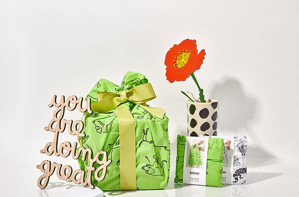

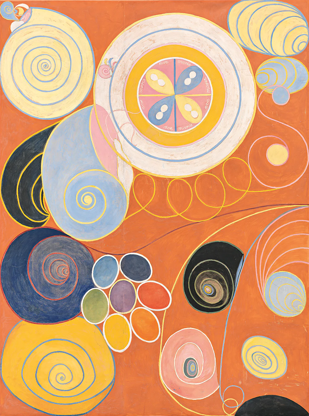
Browse by Color: Bold + Bright
Looking for a different vibe?
Sign up for our newsletter to get 15% off your first order!
Sign up for our newsletter to get first access to new editions, catch the freshest commentary + features, and snag a special discount.